Angular 4 – UI Component using ContentChildren
Introduction
In creating data driven web applications, we often write the same type of HTML and CSS over and over again throughout the application like a Table or a form group if you are using bootstrap. So we sometimes use themes that provide nice looking UI elements then we can just copy and paste the HTML codes. We end up with a bunch of duplicate HTML codes but we can create a reusable component or directive in Angular to render the HTML codes we want. There are times where themes don’t work well with Angular because it is adding its own tags like the following:
The example above will not work if its CSS requires a specific structure e.g. Flex Layout. In Angular 1, you can set replace option to true and it will not output the custom tags to the browser, but since Angular 2, that feature is no longer available.
So in this post we will create a component that uses @ContentChildren to render a responsive table layout.
Objective
In this post, we will create a responsive table using Angular’s @ContentChildren decorator.
This is the markup I want to achieve.
<rtable [rows]="books">
    <rtable-cell header="Thumbnail"
                 type="image">
        <ng-template #template
                     let-book>
            <img src="/assets/{{ book.imageSrc }}">
        </ng-template>
    </rtable-cell>
    <rtable-cell header="ISBN"
                 field="isbn"></rtable-cell>
    <rtable-cell header="Title"
                 field="title"></rtable-cell>
    <rtable-cell header="Date Published"
                 field="publish.datePublished"
                 type="date"></rtable-cell>
    <rtable-cell header="Published By"
                 field="publish.publisherName"></rtable-cell>
    <rtable-cell header="Author"
                 field="author"></rtable-cell>
    <rtable-cell header="Price"
                 field="price"
                 type="money"></rtable-cell>
    <rtable-cell header="Action">
        <ng-template #template
                     let-book>
            <button>Buy Now</button>
            <button>Add to Wishlist</button>
        </ng-template>
    </rtable-cell>
</rtable>
Folder Structure
This is my chosen folder structure but you can change it however you want.
- app/components/responsive-table/responsive-table.component.html – We will put most of the HTML codes for the responsive table component.
- app/components/responsive-table/responsive-table.component.ts – We will put most of the JS codes for the responsive table component, not just the root element but also for the column so we don’t have so many files for a simple project.
- app/components/responsive-table/test-table.component.ts – This file will not be used in this post but is included in the repository to show an example of a component that uses <ng-content>.
- app/components/shared/template-renderer.component.ts – We will create a component that will render some views that we will use internally.
- app/app.component.html – Here we will use our component.
- assets/ – This folder contain some sample images.
- styles.css – This contains some styles for the responsive table layout.
- Other files and folders are generated by
ng newcommand of Angular CLI.
Now, I will show you the HTML and TypeScript code I started of and let us slowly convert it into a component.
app.component.html
<div class="tbl-container">
    <div class="tbl-head">
        <div class="tbl-cell">
            Thumbnail
        </div>
        <div class="tbl-cell">
            ISBN
        </div>
        <div class="tbl-cell">
            Title
        </div>
        <div class="tbl-cell">
            Date Published
        </div>
        <div class="tbl-cell">
            Published By
        </div>
        <div class="tbl-cell">
            Price
        </div>
        <div class="tbl-cell">
            Author
        </div>
        <div class="tbl-cell">
            Action
        </div>
    </div>
    <div class="tbl-body">
        <div class="tbl-row"
             *ngFor="let book of books;">
            <div class="tbl-cell tbl-cell-img">
                <img src="/assets/{{ book.imageSrc }}">
            </div>
            <div class="tbl-cell">
                <div class="tbl-cell-title">
                    ISBN
                </div>
                <div class="tbl-cell-value">
                    {{ book.isbn }}
                </div>
            </div>
            <div class="tbl-cell">
                <div class="tbl-cell-title">
                    Title
                </div>
                <div class="tbl-cell-value">
                    {{ book.title }}
                </div>
            </div>
            <div class="tbl-cell">
                <div class="tbl-cell-title">
                    Date Published
                </div>
                <div class="tbl-cell-value">
                    {{ book.publish.datePublished | date:'short' }}
                </div>
            </div>
            <div class="tbl-cell">
                <div class="tbl-cell-title">
                    Published By
                </div>
                <div class="tbl-cell-value">
                    {{ book.publish.publisherName }}
                </div>
            </div>
            <div class="tbl-cell">
                <div class="tbl-cell-title">
                    Price
                </div>
                <div class="tbl-cell-value">
                    {{ book.price | currency:'USD':'$' }}
                </div>
            </div>
            <div class="tbl-cell">
                <div class="tbl-cell-title">
                    Author
                </div>
                <div class="tbl-cell-value">
                    {{ book.author }}
                </div>
            </div>
            <div class="tbl-cell">
                <button>Buy Now</button>
                <button>Add to Wishlist</button>
            </div>
        </div>
    </div>
</div>
app.component.ts
import { Component } from '@angular/core';

@Component({
    selector: 'app-root',
    templateUrl: './app.component.html',
})
export class AppComponent {

    books = [
        {
            isbn: '978-1885167774',
            title: 'One Thing',
            publish: { datePublished: 'April 1, 2013', publisherName: 'Bard Press' },
            price: 15.35,
            author: 'Garry Keller, Jay Papasan',
            imageSrc: '1.jpg'
        },
        {
            isbn: '978-0399169472',
            title: 'The Happiness Equation',
            publish: { datePublished: 'March 8, 2016', publisherName: 'G.P. Putnam\'s Sons' },
            price: 16.99,
            author: 'Neil Pasricha',
            imageSrc: '2.jpg'
        },
        {
            isbn: '978-1451612592',
            title: 'How to Win Friends and Influence People',
            publish: { datePublished: 'December 25, 2012', publisherName: 'Simon & Schuster' },
            price: 10.23,
            author: 'Dale Carnegie',
            imageSrc: '3.jpg'
        },
        {
            isbn: '978-1934356340',
            title: 'The Passionate Programmer',
            publish: { datePublished: 'June 7, 2009', publisherName: 'Pragmatic Bookshelf' },
            price: 13.89,
            author: 'Chad Fowler',
            imageSrc: '4.jpg'
        },
    ];

}
styles.css
@media (min-width: 577px) {
    .tbl-head,
    .tbl-row {
        display: flex;
    }
    .tbl-cell-title {
        display: none;
    }
    .tbl-cell-img img {
        max-width: 100px;
        max-height: 100px;
        display: inline;
        margin: 0 auto;
    }
}
@media (max-width: 576px) {
    .tbl-head {
        display: none;
    }
    .tbl-row {
        border: solid 1px rgb(145, 145, 145);
        margin-bottom: 10px;
    }
    .tbl-cell-title {
        flex: 1;
    }
    .tbl-cell-value {
        flex: 1;
    }
    .tbl-cell-img img {
        max-height: 200px;
        display: inline;
        margin: 0 auto;
    }
}

.tbl-cell {
    display: flex;
    justify-content: center;
    align-items: center;
    flex: 1;
    border: solid 1px #eee;
    padding: 3px;
}

.tbl-head .tbl-cell,
.tbl-cell-title {
    font-weight: bold;
}
button {
    display: inline-block;
}
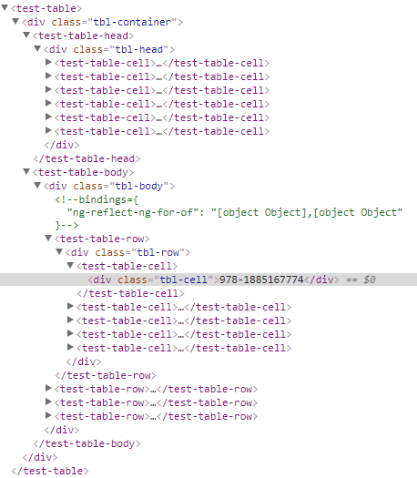
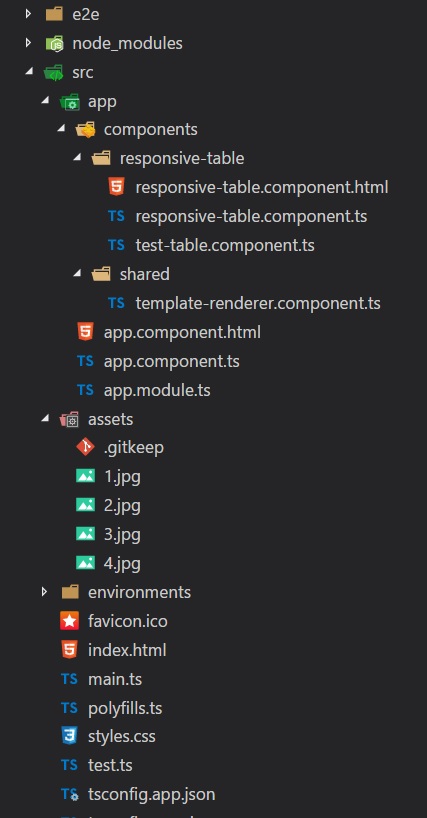
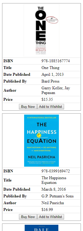
Screenshots

Let’s Start
Create your responsive-table.component.ts file if you haven’t already and write this code.
import { Component, Input, ContentChildren, QueryList} from "@angular/core";


@Component({
    selector: 'rtable',
    templateUrl: 'responsive-table.component.html'
})
export class ResponsiveTableComponent {

    @Input()
    rows: Array<any>

    @ContentChildren(ResponsiveTableCellComponent) columns: QueryList<ResponsiveTableCellComponent>;

}
This part is when we create the root element of our UI component <rtable with an attribute rows. Whatever you pass on that attribute when using the component will be stored in that variable. If you don’t like “rows” as attribute you can assign an alias like this @Input("myrows"). It is just by default uses the variable name as the attribute name.
The property columns is where all the child elements will be stored which we have not created.
@ContentChildren
@ContentChildren can take type or string as argument for what elements you want to capture. In this case any tags under <rtable> that are of type ResponsiveTableCellComponent will be stored in columns property of ResponsiveTableComponent.
@QueryList means you will get a list that also updates the value when something has change.
There is also a decorator called @ContentChild and the difference is actually simple. @ContentChildren will be able to capture list of elements while @ContentChild can only capture one element like so @ContentChild('template', { read: TemplateRef }) template: TemplateRef<any>;. I will use @ContentChild when we implement the custom content inside <rtable-cell> which is a separate blog post.

I will just put the codes for ResponsiveTableCellComponent class in responsive-table.component.ts but you can separate them if you want.
import { Component, Input, ContentChildren, QueryList} from "@angular/core";

@Component({
    selector: 'rtable-cell',
    template: ''
})
export class ResponsiveTableCellComponent {

    @Input()
    header: string;

    @Input()
    field: string;

}

// Codes for ResponsiveTableComponent is not included for brevity
If you take a look at the template of this component, it is an empty string. We don’t want to render anything when <rtable-cell> is used because we will use the ResponsiveTableComponent, the parent component, to render the correct markup.
We will now write the ResponsiveTableComponent‘s template to make these things more clear.
responsive-table.component.html
<div class="tbl-container">
    <div class="tbl-head">
        <div class="tbl-cell"
             *ngFor="let c of columns">
            {{ c.header }}
        </div>
    </div>
    <div class="tbl-body">
        <div class="tbl-row"
             *ngFor="let r of rows;">
            <div class="tbl-cell"
                 *ngFor="let c of columns">
                {{ r[c.field] }}
            </div>
        </div>
    </div>
</div>
As you can see, we are now using the ResponsiveTableComponent‘s properties to render the headers, rows, and cells.
Let us now add the new components to our app.module.ts.
@NgModule({
    declarations: [
        AppComponent,
        ResponsiveTableComponent,
        ResponsiveTableCellComponent,
    ],
    imports: [
        BrowserModule
    ],
    providers: [],
    bootstrap: [AppComponent]
})
export class AppModule { }
We can now use the markup in our app.component.html and run it on the browser.
<rtable [rows]="books">
    <rtable-cell header="Thumbnail"
                 type="image">
        <ng-template #template
                     let-book>
            <img src="/assets/{{ book.imageSrc }}">
        </ng-template>
    </rtable-cell>
    <rtable-cell header="ISBN"
                 field="isbn"></rtable-cell>
    <rtable-cell header="Title"
                 field="title"></rtable-cell>
    <rtable-cell header="Date Published"
                 field="publish.datePublished"
                 type="date"></rtable-cell>
    <rtable-cell header="Published By"
                 field="publish.publisherName"></rtable-cell>
    <rtable-cell header="Author"
                 field="author"></rtable-cell>
    <rtable-cell header="Price"
                 field="price"
                 type="money"></rtable-cell>
    <rtable-cell header="Action">
        <ng-template #template
                     let-book>
            <button>Buy Now</button>
            <button>Add to Wishlist</button>
        </ng-template>
    </rtable-cell>
</rtable>
Run
One problem with our responsive-table.component.html is the {{ r[c.field] }}. It cannot render fields that uses the dot notation e.g.
<rtable-cell header="Date Published"
                 field="publish.datePublished"
                 type="date"></rtable-cell>
In this case we don’t have a choice but to create a method that will parse the dot notation.
responsive-table.component.ts
export class ResponsiveTableComponent {

    // Codes removed for brevity

    parseDotNotation(data: any, field: string): any {
        if (data && field) {
            if (field.indexOf('.') == -1) {
                return data[field];
            } else {
                let fields: string[] = field.split('.');
                let value = data;
                for (var i = 0, len = fields.length; i < len; ++i) {
                    if (value == null) {
                        return null;
                    }
                    value = value[fields[i]];
                }
                return value;
            }
        } else {
            return null;
        }
    }
}
So now we have to update responsive-table.component.html to use the method we just created.
<div class="tbl-container">
    <div class="tbl-head">
        <div class="tbl-cell"
             *ngFor="let c of columns">
            {{ c.header }}
        </div>
    </div>
    <div class="tbl-body">
        <div class="tbl-row"
             *ngFor="let r of rows;">
            <div class="tbl-cell"
                 *ngFor="let c of columns">
                {{ parseDotNotation(r, c.field) }}
            </div>
        </div>
    </div>
</div>
You should be able to see some nice results but we still have some other features we need to implement. But I will leave these features in the next blog post to keep this post short.
1. Allowing custom content inside <rtable-cell>.
<rtable-cell header="Action">
    <ng-template #template
                 let-book>
        <button>Buy Now</button>
        <button>Add to Wishlist</button>
    </ng-template>
</rtable-cell>
2. Adding type attribute in <rtable-cell> to format data.
<rtable-cell header="Date Published"
             field="publish.datePublished"
             type="date"></rtable-cell>
That is it for this post for now. Thank you for reading!